Case Study
Monthly content performance tracking unlocks automated AI insights
Part of Vizit’s suite of tools is Content Effectiveness Monitoring — referred to casually as simply "Monitoring."
Vizit’s original platform — Studio — involved a lot of manual work. Users must find and download their competitors’ images (sometimes hundreds or thousands), compile their own images (tens to hundreds), upload them Vizit and organize them themselves.
Monitoring automates all of that for the user. Simply paste in a link to Amazon and Vizit will source, organize, and score all your assets compared to the thousands of images Vizit also pulls from your competition on Amazon.
Each Monitor is made up of the images that can be seen on that product’s Amazon page. Those images are scored, and an algorithm uses those individual scores to create a a larger "Listing Score."
"It’s great to see how we score right now, but what should I change to improve those scores?"
"If I make the recommended changes, what would my new scores be? Do I need to wait until the next month to find out?
Ecommerce Marketing Managers
These users are often the team members who take images and post them to ecommerce listings. Their goal is to understand which assets — and in what order — to post to a product's Amazon page.
Graphic Designers
These users are the ones editing the images posted to an ecommerce listing. They need to know which elements to change in an image to help increase its score. They often make different variations of each image, and share only the highest scoring variation.
Roles
Design Director
Principal Product Manager
Design Manager (me)
Senior Designer
Small team of developers
My tactical design work for this project was to create the Experiments page — a new page that allowed users to make changes to their current product listing's images and see how that would effect their Listing Score. They could upload new images and/or rearrange existing images to instantly watch their score increase or decrease.
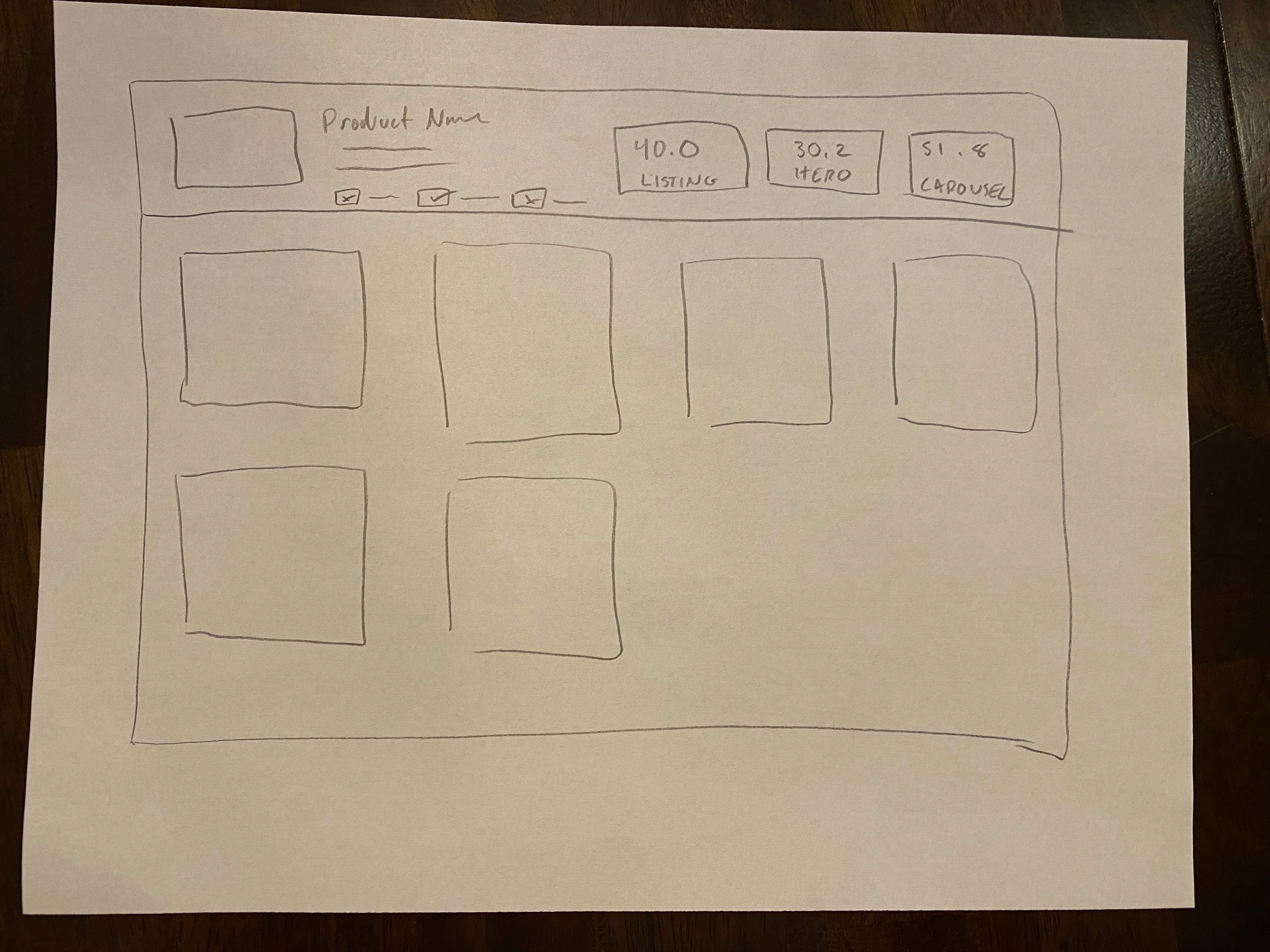
Sketching
My starting point for design work is to sketch out my ideas on paper or on a whiteboard. This allows me to quickly test concepts with stakeholders and other designers. We want to make sure our solutions are addressing user needs, so this helps get the conversation started early — and lets us pivot much faster.
Iterating in Figma
Once I have a solid idea of where the design direction is leaning, I can quickly build and iterate in Figma.
Left: The Original Product Listing, scoring a 2.0 (Very Low)
Right: The Experiment, or "Optimization," scoring 90.0 (Very High)
Early iterations focused on a drag and drop approach, allowing users to easily see and rearrange a stack of their assets and their scores.
Prototyping
If you'd like, you can watch the video below for more context. It's fairly long (~8 minutes), but gives you an idea of what the users' goals are, and how these Experiments (or Optimizations) can help users improve their listings.
User feedback showed that while easy to rearrange images, the images themselves were too small.
Collaboration and Further Iteration
Users also wanted a better way to visualize and understand Vizit's recommendations on how to improve their content. The Senior Designer created Optimization Recommendation cards for another page, so it naturally made sense to keep the user experience consistent and integrate them into the page I was designing.
These cards give specific recommendations and instructions for users so they can take meaningful changes to improve their Listing Score.
We took those pieces of feedback and made some changes. We used a grid of images instead of a list, and worked in a side panel to hold the cards above.
We released this next iteration, which includes all the same interactions as the prototype video above: Users can rearrange assets, upload new assets, remove poor scoring assets, and replace assets.
This was an upgrade, but that didn’t stop us from continuing the feedback cycle and making improvements.
Enhancements
The version above was released as an MVP. It was time to continue iterating and adding user value.
The next consistent feedback was that users wanted a place to store different versions of the same image. If Vizit told a user that they should change an image in a specific way, users wanted to group the original image alongside the variations with small changes. Seeing how each new variation’s score improved is valuable for both understand what is contributing to its score as well as showing other team members what you've done.
We then added on a “Slot Variation” page. This helped users organize and store the different iterations of their images. Users can "promote" any variation, meaning it will take the place of the original image back on the Experiment page.
Example below: Instead of Slot 2 having a score of 12.2, replacing it with a different variation that scores a 90.0 will increase the product's Listing Score dramatically.
The iterative and agile design process is still happening. The feature continues to get improved upon as this automated style of insights is key to the future roadmap of the company.
The original version of Monitoring only had a few reoccurring weekly users. Thanks to the additional of Experiments and Variations, there has been a dramatic increase in weekly users and these flows are making their way into customer internal processes.


