Case Study
Building, maintaining, and introducing token variables to an AI SaaS design system

Vizit leverages its patented AI to analyze images and predict how engaging those images will be to a specific target audience.
When I joined Vizit, there were roughly 20 or so employees. The app was about a year old and only used by a handful of users. When I left, there were hundreds of users. To fully support this scaling, Vizit needed an illustrious Design System.
As a Lead Designer and Design Manager, I helped build, maintain, organize and revamp the Vizit Design System, Raven.
e
Step 1: Condense Color Palettes
The old design system had too many color palettes, and too many colors within each palette. There were different palettes for greys, slates, brand colors, and system colors. The grays and slates were only utilizing roughly 30% of each palette, and there was a lot of overlap between these colors.
Step 2: Convert and Contextualize Color "Styles" to "Variables" to Match Dev Tokens
Our front-end team had not created tokens for our colors, so each color was loosely coded. A joint effort was made across design and dev to align our tokens and contextualize the use of each color.
There was no systematic way to assign a color to a component or element; loose colors from the old palettes were assigned to backgrounds, surfaces, foregrounds based on historical precedent, not documented context.
Step 3: Documentation
Our components were built really well already; we put a lot of care, effort and thought into the build of each component. We didn't allow unnamed or extra layers, and every frame used auto-layout, with few exceptions when absolutely necessary. Components could scale based on size, and had only the proper variants and states. Component design was never an issue.
However, documentation was an issue. We had these great components, but no resources to outline the design, states, interaction or context. This was okay for a small team, but as we planned for future scale, clean-up needed to be done.
Product Design Manager and Lead Designer (me)
Senior Product Designer
Senior Product Designer
My role was to lead the initiative from a strategic and organization standpoint, direct and review other designers' work, and be a tactical member of the team — designing, organizing and documenting at an equal level as other ICs.
Specifically, I took on 100% of the color and tokenization work you will see below.
Atomic Design
Before diving into how we solved the provlems above, it's important to understand how the Raven Design System utilized the Atomic Design methodology.
Atoms are the most basic building blocks we worked with, which we considered to be all the standard UI elements like buttons, checkboxes, and fields.
Atoms grouped together are molecules, which we used too build things like inputs with selectors, headers, and other multi-faceted components.
Molecules get grouped to build more complex components and systems, like full side panels.
These factors continue to build and allow seamless design edits and scaling throughout the app.

The old color library used two palettes for background, surface, and foreground elements: greys and slates. There wasn't a systematic way to determine when to use which palette. Also, there was a lot of overlap between the edges of the palettes.
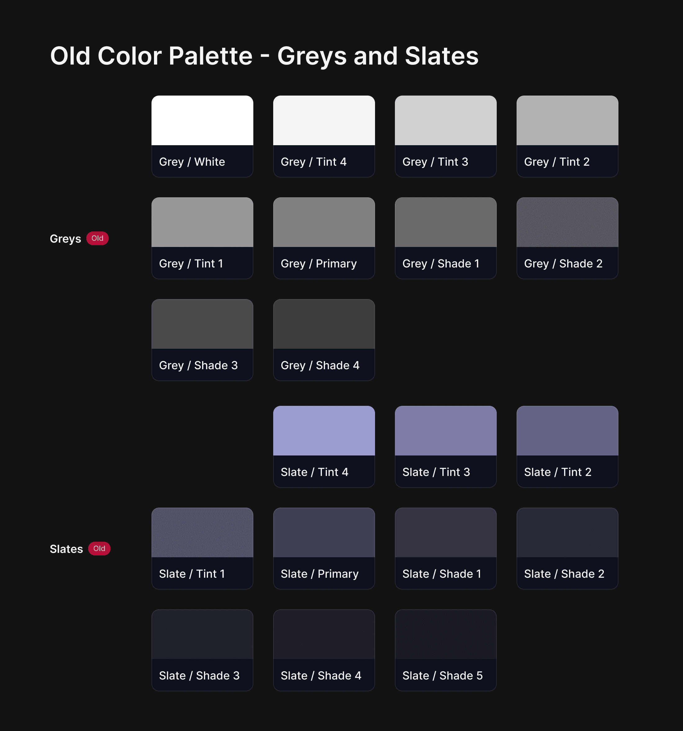
The first step was to combine these two palettes to create one new palette, now named "Slates," to serve as the single source of standard UI elements in the platform.
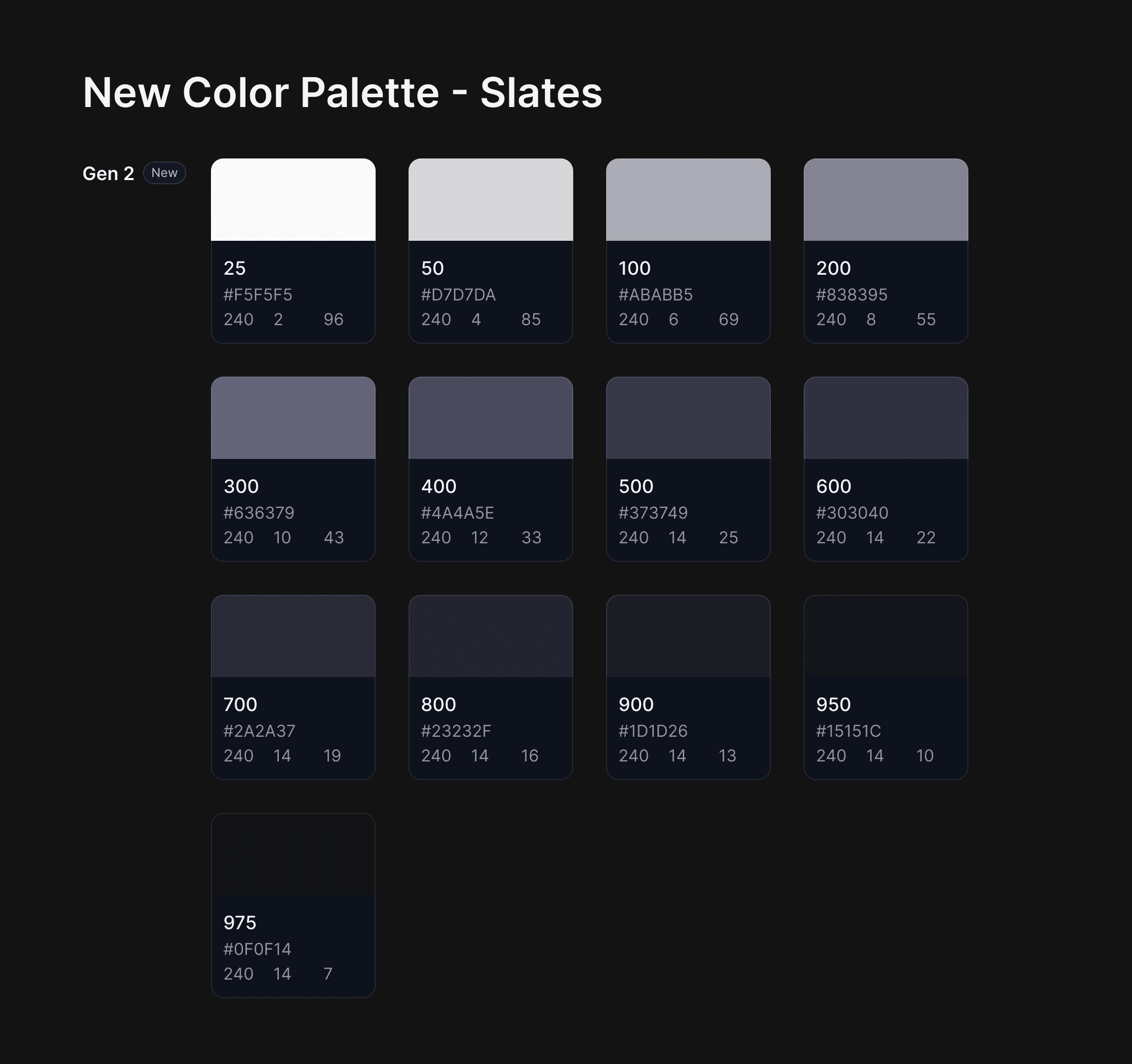
Greys and slates were combined and altered to create one seamless palette for all UI elements like backgrounds, surfaces and foreground items. These colors are not an exact match to the old colors; a consistent HSL scale was needed to ensure continuity between each step.
Additionally, the names of the colors were changed to match standard front-end engineering practices. This step was repeated for all palettes within the color library.
In 2023, Figma released Variables — its answer to how to better align with front-end tokens. At the time, Raven was strictly using Figma Color Styles. Styles were hard-coded to a specific color, and made changing color themes difficult. Additionally, color styles needed to be converted to tokens by engineering teams.
In late 2023 and throughout 2024, I spearheaded and organized the campaign to convert Raven from a Color Styles design system to a Color Variables design system. The outcome of this change helped better align with our dev team, and made contextually defining our color usage a lot easier.